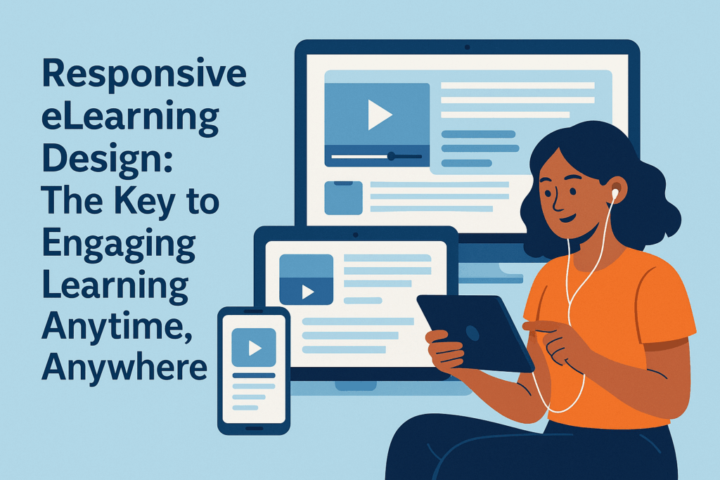
In the world of online education, how your content adapts to different screens can make or break the learning experience. Responsive eLearning design is a method of creating learning materials that automatically adjust to any device—whether it’s a desktop computer, tablet, or smartphone. This approach ensures learners don’t have to deal with awkward scrolling or resizing; instead, they enjoy a smooth, user-friendly experience no matter where they are or what device they’re using.
What Makes Responsive eLearning Important?
Think about it. Learners often switch between devices throughout their day—starting a lesson on their laptop at work, then picking up where they left off on their phone during a commute. If the course content isn’t designed responsively, it can become frustrating to navigate, which can lead to disengagement or even dropping out. Responsive design eliminates these hurdles by making sure your courses look great and function well across all platforms.
Meet Instancy: A Powerful Suite for Responsive eLearning
When it comes to creating responsive eLearning content, Instancy stands out as one of the best choices available. Instancy is not just a single tool—it’s a comprehensive Learning Content Management System (LCMS) combined with a versatile authoring suite. This integrated setup empowers educators, trainers, and organizations to build a wide variety of learning experiences in one place.
What sets Instancy apart is the incredible range of content types you can create:
- Microlearning modules: Short, focused bursts of learning perfect for busy schedules.
- Interactive lessons: Engaging scenarios that require active participation.
- Assessments: Quizzes and tests to evaluate learner progress.
- AI tutors: Personalized assistance powered by artificial intelligence.
- Role plays: Realistic practice environments for skill-building.
- Virtual reality: Immersive experiences for hands-on learning.
- Software simulations: Step-by-step guides for mastering complex tools.
- Video tutorials: Clear, visual instructions that simplify complex ideas.
Create Once, Deliver Everywhere
With Instancy, you design your content once, and it automatically adapts for both web browsers and native mobile formats. This means learners receive an optimized experience whether they’re on a desktop or using an app on their phone. No need for separate versions or complicated adjustments—Instancy handles all the technical magic behind the scenes.
Why Choose Instancy for Responsive eLearning?
- Integrated tool suite that supports a diverse range of learning formats.
- Seamless content delivery across devices without extra effort.
- Designed with modern learners in mind, who expect flexibility and interactivity.
- Efficient content creation process that saves time and resources.
In summary, responsive eLearning design is essential to meet learners where they are and keep them engaged. Instancy’s powerful LCMS and authoring tools make it easier than ever to create versatile, immersive content that shines on any screen. Whether you’re an educator, corporate trainer, or content developer, Instancy is a strong partner to help you build the kind of learning experiences that learners will love and benefit from.
Explore Instancy today and see how responsive eLearning can transform your training and education programs.


 English
  Arabic